A Stylist’s eye on London Design Week –
It’s London Design Week at the Design Centre, in Chelsea Harbour. There is such a lively buzz of excitement and a warm welcome when you arrive at this beautiful venue. Although this is usually the playground for Architects and Interior Designers, it’s doors are open to all. Entrance is free and when it’s not a trade only day anyone can take advantage of the live demos, attend guided tours and workshops and meet some of the experts in the Interior Design world.
With a massive 120 showrooms featuring around 600 brands you really do need to go with a plan of action. As a general shopper you may feel overwhelmed – there is just so much to see.
Catering mainly for the Interior Design Trade, companies show samples of all their designs. This makes some showrooms a bit library like, with row on row of fabrics and wallpapers. Most Interior Designers will know which brands to head for. They will know the style they favour or are hoping to achieve.
However, if you are looking for inspiration, or trying to find your style – it’s a great place to just go to have a browse and a coffee.
You will find showrooms that high-light and feature their new designs with brilliant window and interior displays. These brands have great expertise in design and they will often show new colour combinations and style that you can take note of and use in your own home.
I have put together a visual tour of the most creative high-lights of the Centre and picked out just a few of the showrooms I love to visit.
ZIMMER + ROHDE
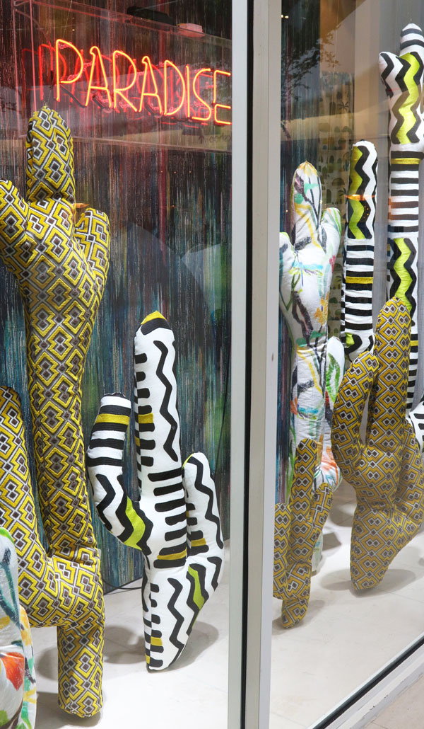
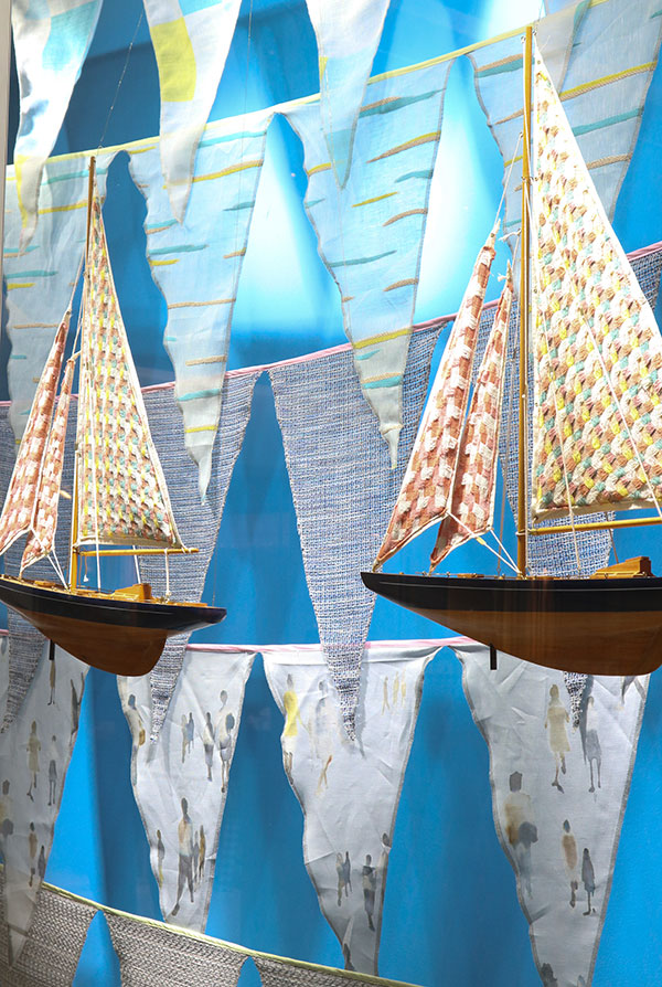
On stepping into the Design Centre I was greeted with imaginative window displays by Zimmer + Rohde. Bright neon signs and Cacti displaying some of their bold and bright ‘Wonderland’ fabrics. This collection being a homage to mythical places and paying tribute to traditional craftsmanship. With another window of sailing ships and fabric bunting creatively showcased it’s Etamine Collection.
TIMOROUS BEASTIES
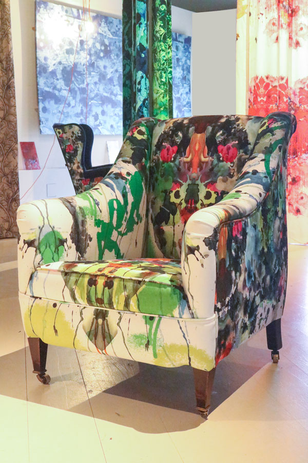
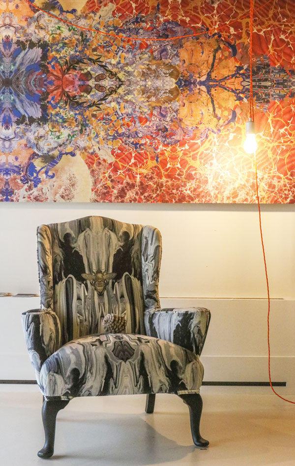
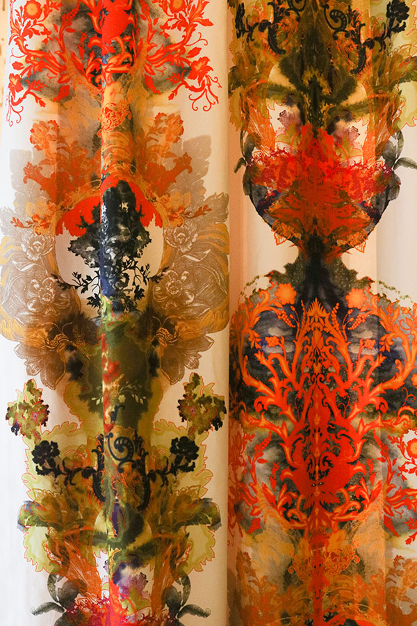
It was refreshing to see Glasgow’s ‘Timourous Beasties’ appearing at the Centre. The tall showroom was just perfect to showcase the scale of their wild and amazing designs. Although only here for a temporary stay – they do have a London Store in Clerkenwell. It was great to see the Kaleidoscope Splatt fabric on the sofa and arm chair. The scale of their designs always create a unique piece of statement furniture.
COLE & SONS
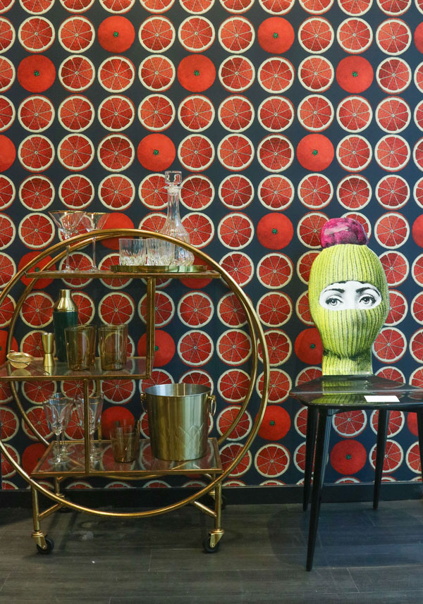
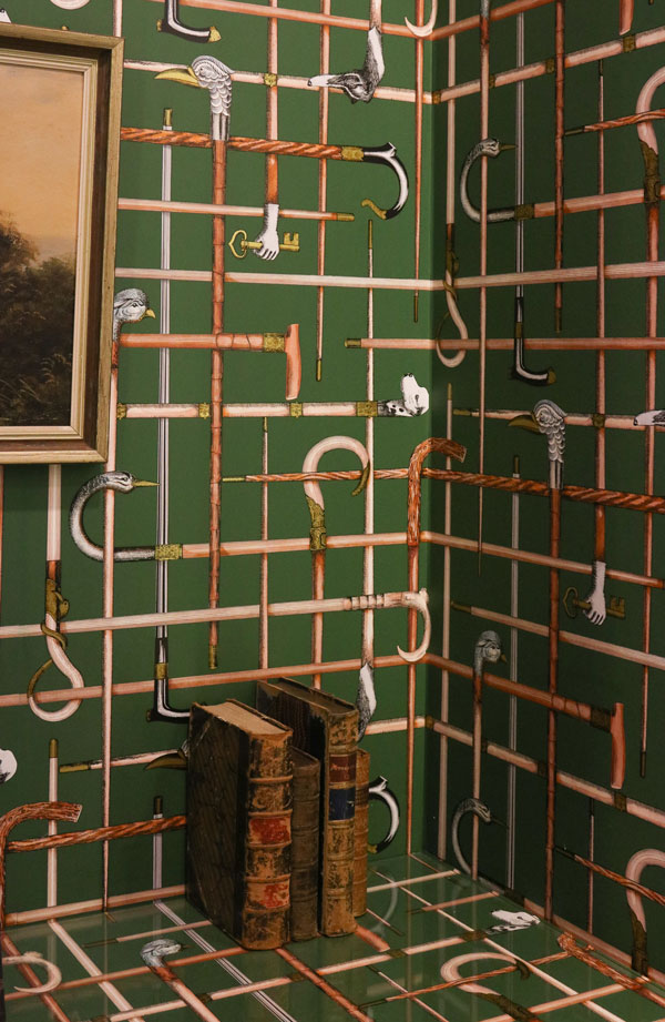
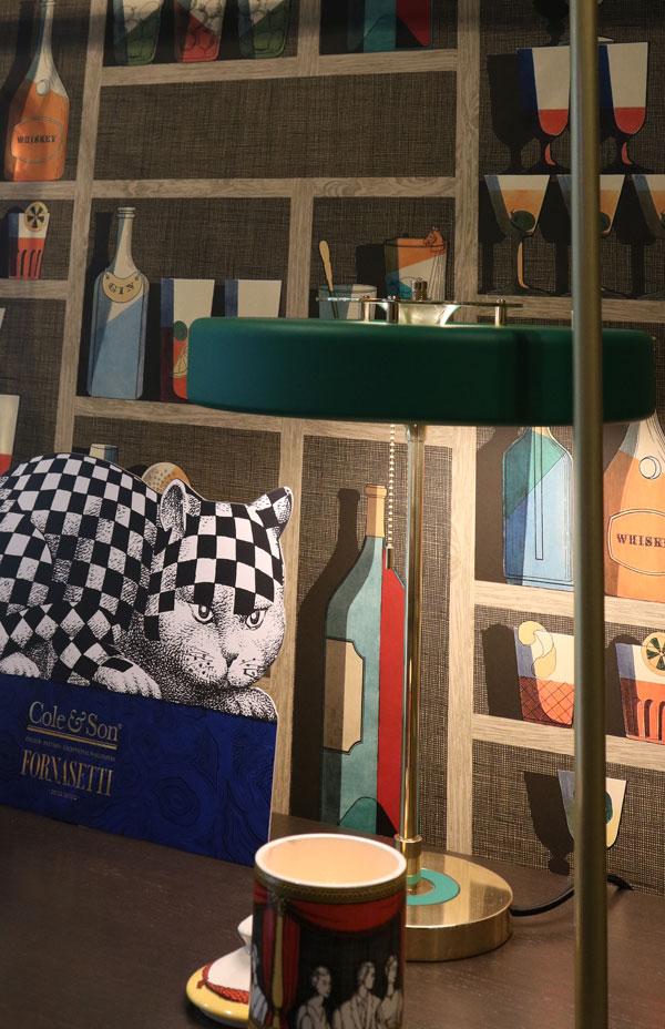
The Cole & Sons showroom was a real delight. Like stepping into another world – the whole studio is decorated with their surreal Fornasetti collection. I could not fail to be wowed by the perfect retro styling and presentation. The Senza Tempo collection delves into Fornasetti’s dreamlike world where elegance and irony are perfectly combined in timeless designs.
ABBOTT + BOYD
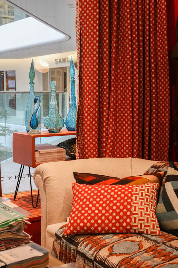
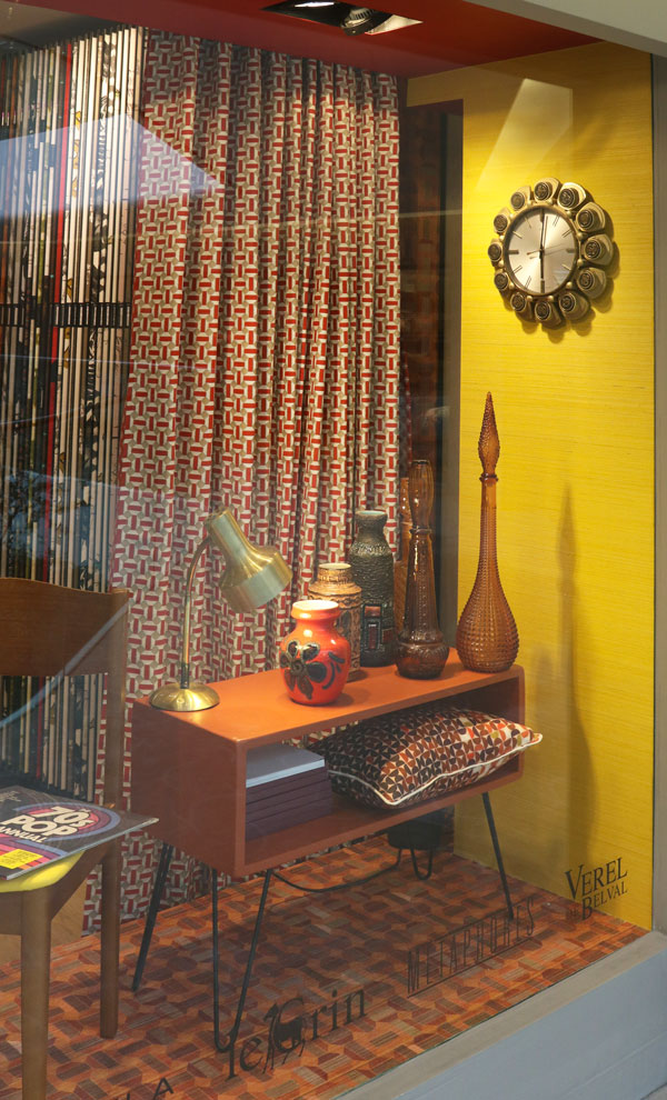
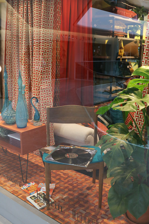
I loved the Retro 70’s windows. Great styling and an imaginative way to present their Elitis indoor/outdoor range. Called appropriately ‘Farniente’ – ‘chilling-out’ in Italian.
THE STYLE LIBRARY
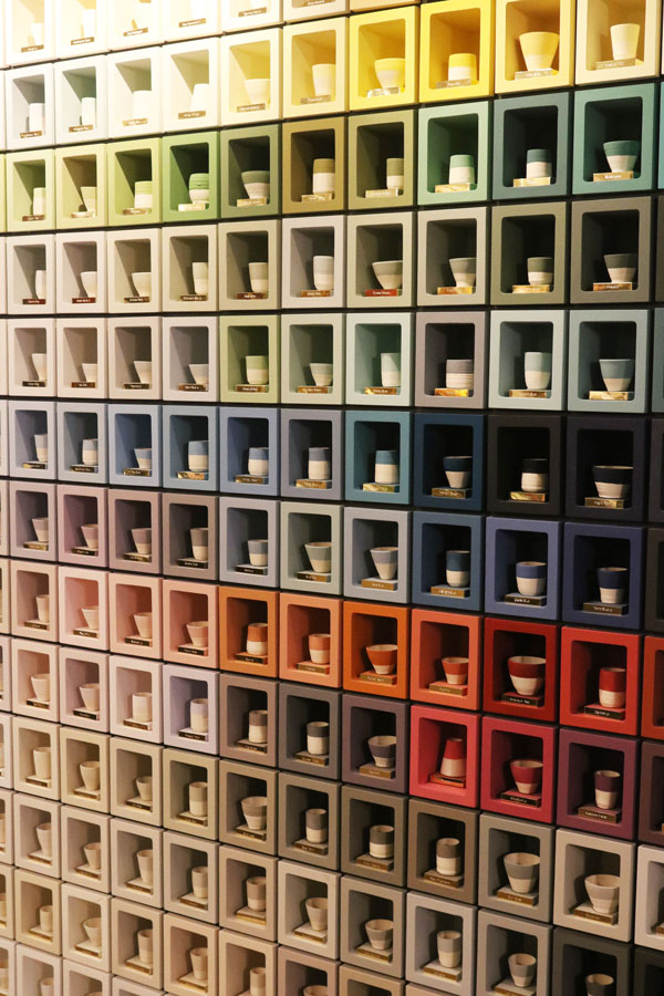
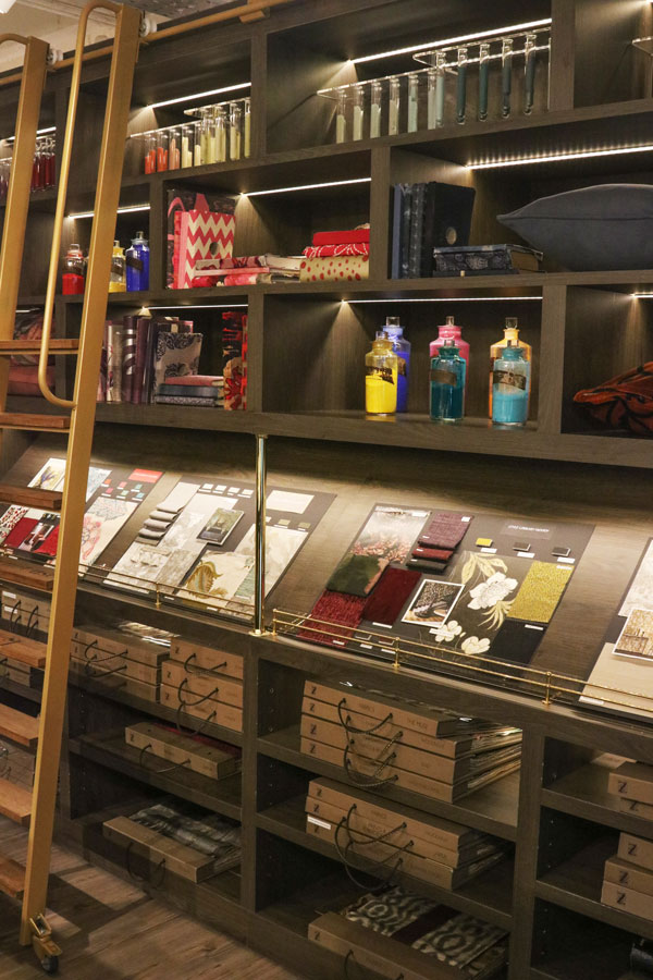
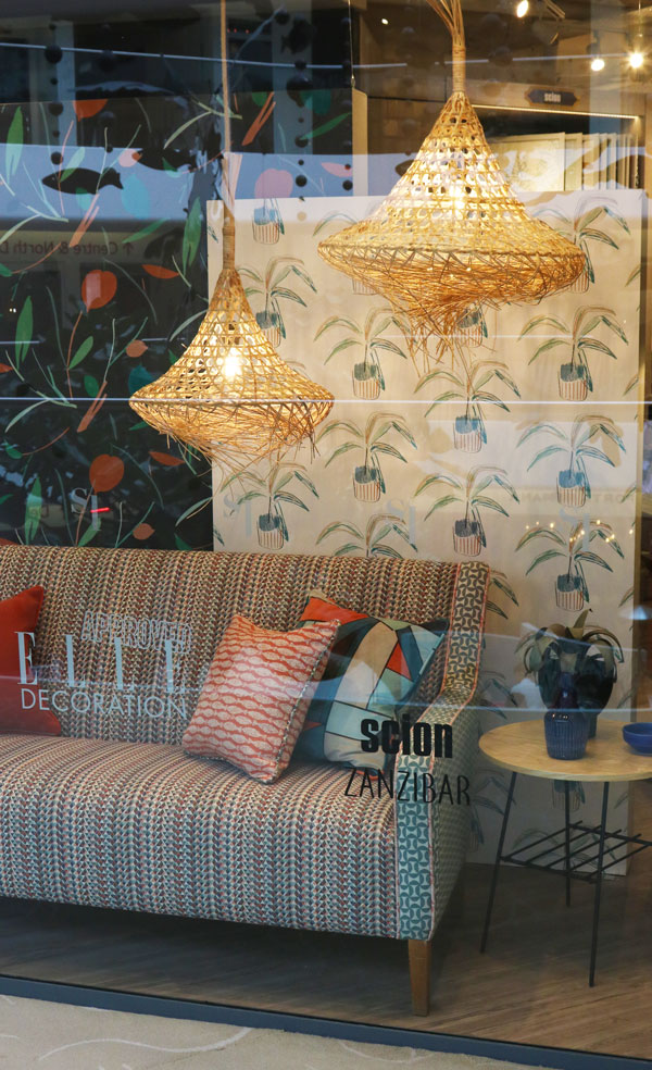
The Style Library has a beautifully presented showroom. Housing the brands Zoffany, Harlequin, Sanderson, Morris &Co, Scion and Anthology. Walls of creative pots of colours showcase the different paint collections. Effective library style wall bays show inspiring designer mood boards. With window displays showcasing new designs and the trend for wicker-work.
WATTS OF WESTMINSTER
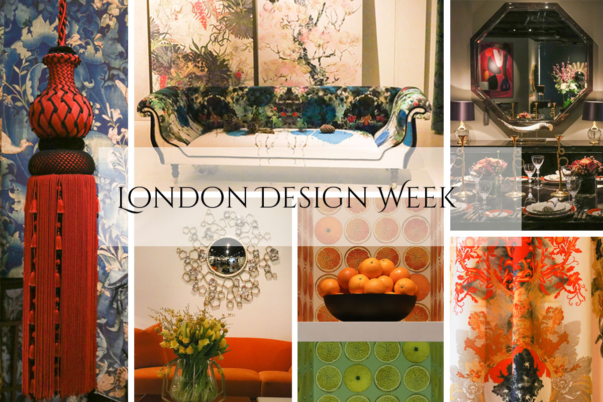
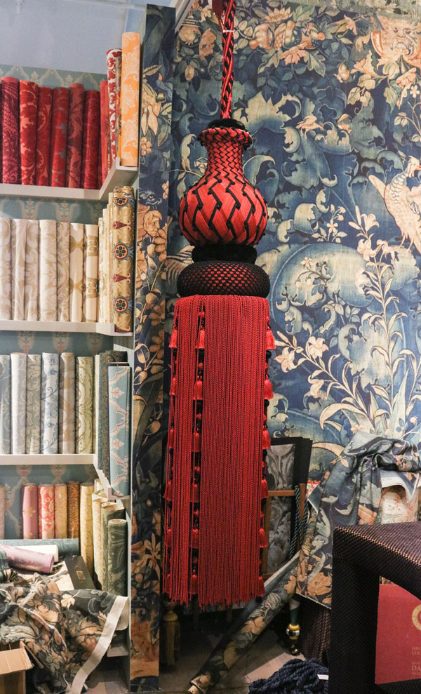
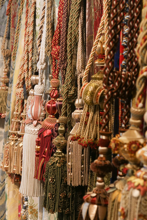
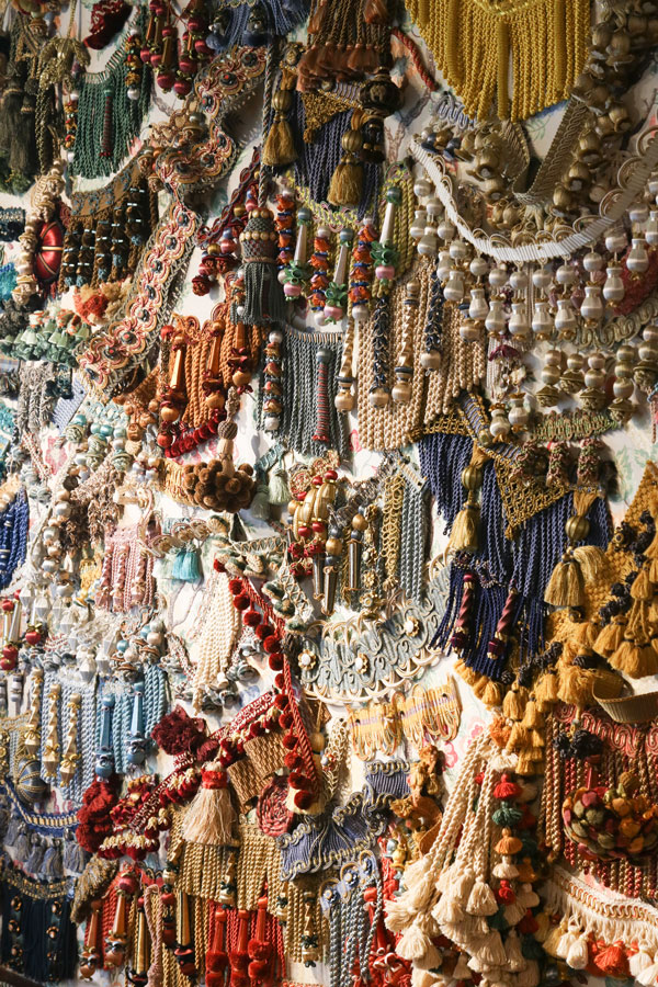
I loved the atmosphere in the Watt’s showroom, just like walking into an exciting bazaar. I had never seen such an amazing collection of tassels and trimmings. The huge hanging tassel that immediately grabbed my attention was nearly 2 meters tall – wow, now that would need a large room!
TURNELL AND GIGON
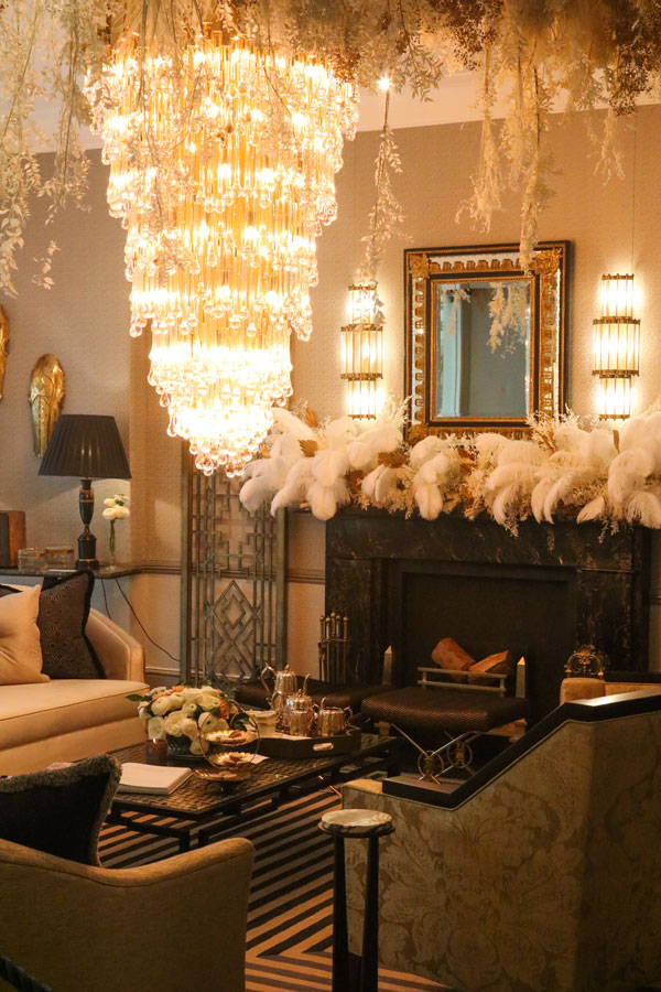
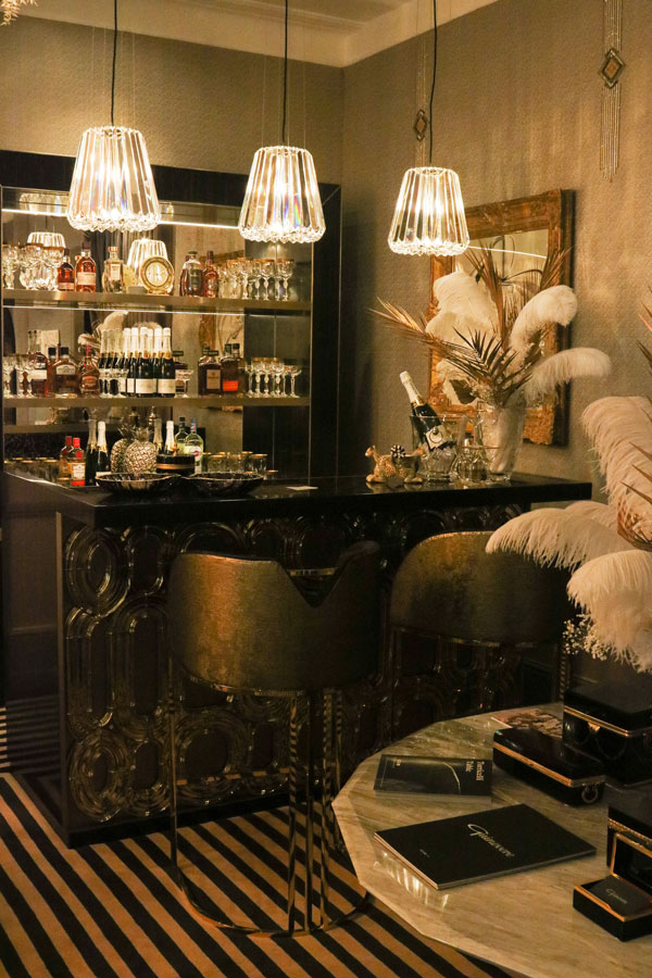
The Turnell and Gigon Studio was another showroom that was a feast for the eye. Showing the Gatsby Suite, an amazing creation, by Katherine Pooley. Opulent over-the-top styling. Swathes of dried foliage and a glass chandelier suspended above a decadent Art Deco room set. Dark and moody with greens and golds and a grand, feather-topped, ornate, period fireplace.
NICHOLAS HASLAM
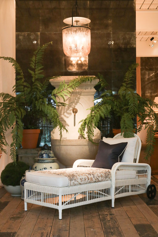
Nicholas Haslam’s centrepiece was focused on his out door furniture. I love the Rhodes Chaise and can imagine relaxing by the lovely fountain.
BAKER
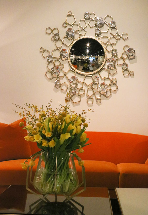
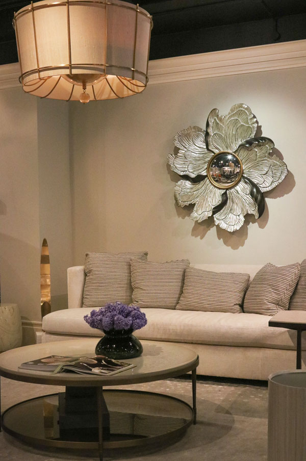
I admired the classic and elegant designs from Baker. Simple styling with bold splashes of colour or more harmonious setting in taupe and gold. The Blossom and Palato mirrors shown below are real statement pieces.
DAVIDSON
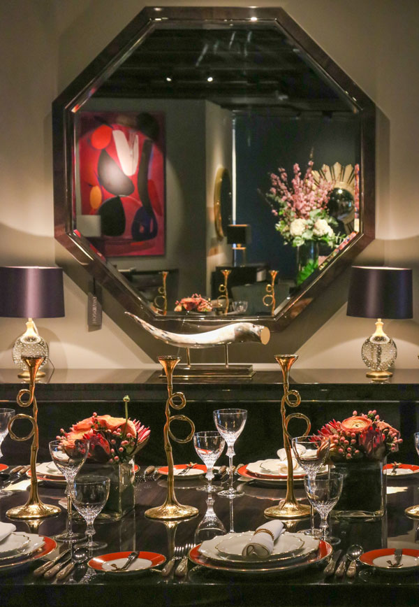
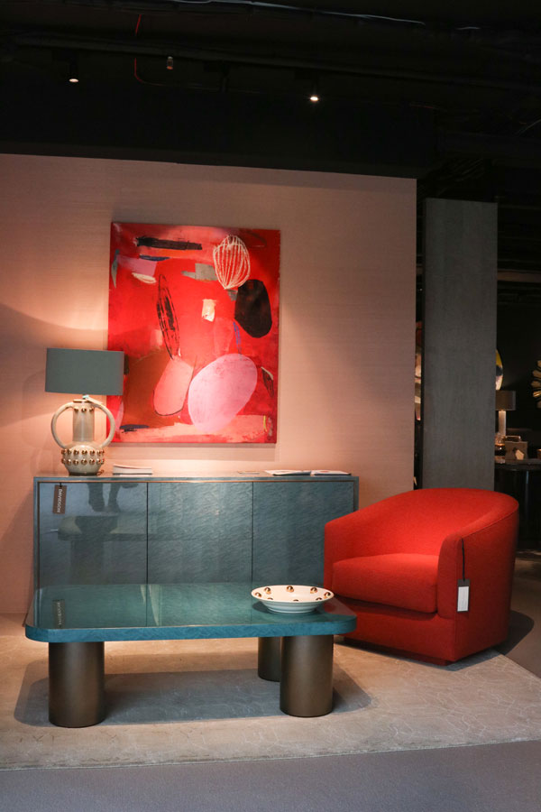
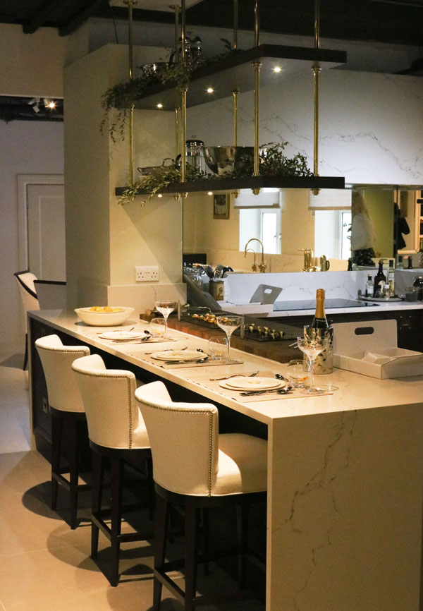
Some fabulous table styling in the Davidson Studio. Seldom do you get to see such a beautiful table setting. The dark interior of the Davidson showroom is a great backdrop for their classic furniture. With clever use of artwork and colour to compliment their designs.
CHRISTOPHER PEACOCK
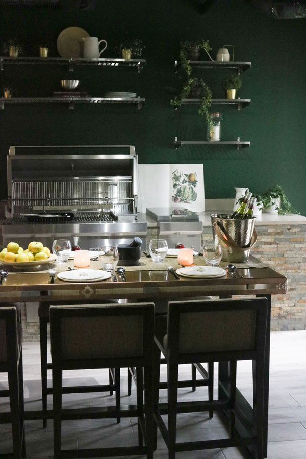
With a host of room sets all beautifully presented and elegantly styled.
VICTORIA + ALBERT
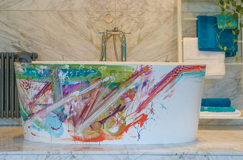
It’s rare to see Bathrooms displayed creatively, but artistic splashes of paint made quite an impression on me at the Victoria + Albert Studio. The central exhibition piece with its daubes of abstract colour was very eye-catching. With artists easels and paint pots used throughout the displays. Artistically showcasing their collection of colourful free-standing baths.
PORTA ROMANO
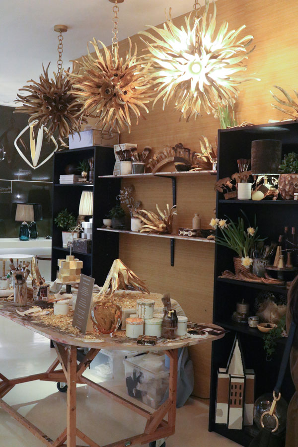
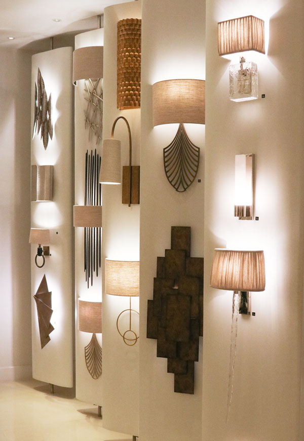
I always look forward to seeing the amazing range of lighting in the Porta Romano showroom. They put on great workshop demo’s – which I unfortunately missed. But it looks as if gold leafing was this weeks presentation. The photos below are just a small sample of the library of lighting that you will always find on show.
GLADEE
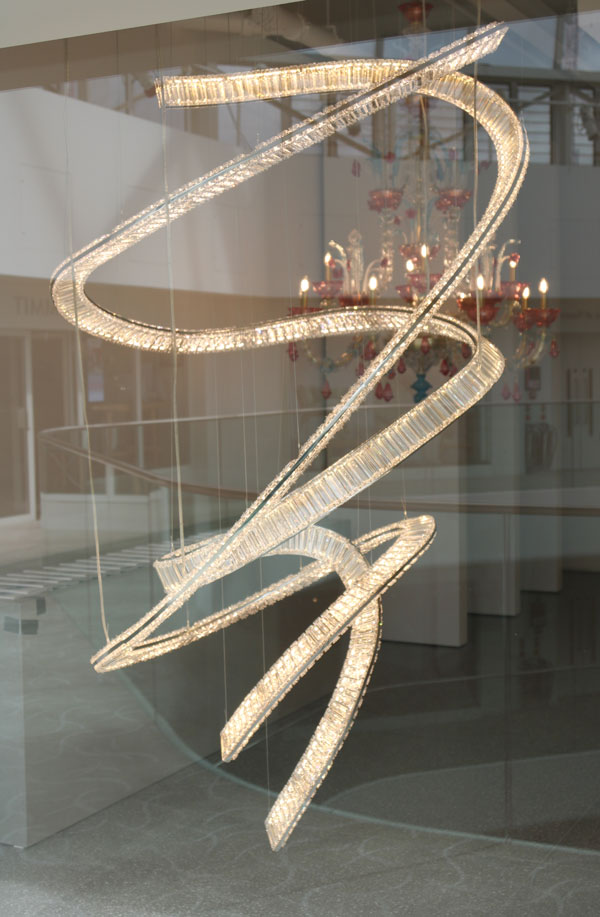
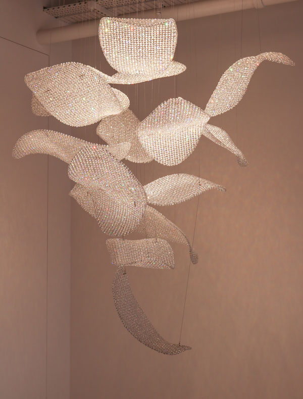
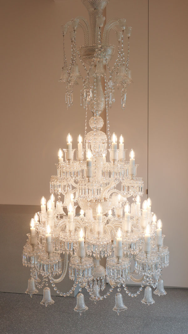
More beautiful lighting to be seen at Gladee. From traditional crystal chandeliers to contemporary sculptural forms and glass installations. The sheer scale of the designs will make you stare in awe.
And finally . . .
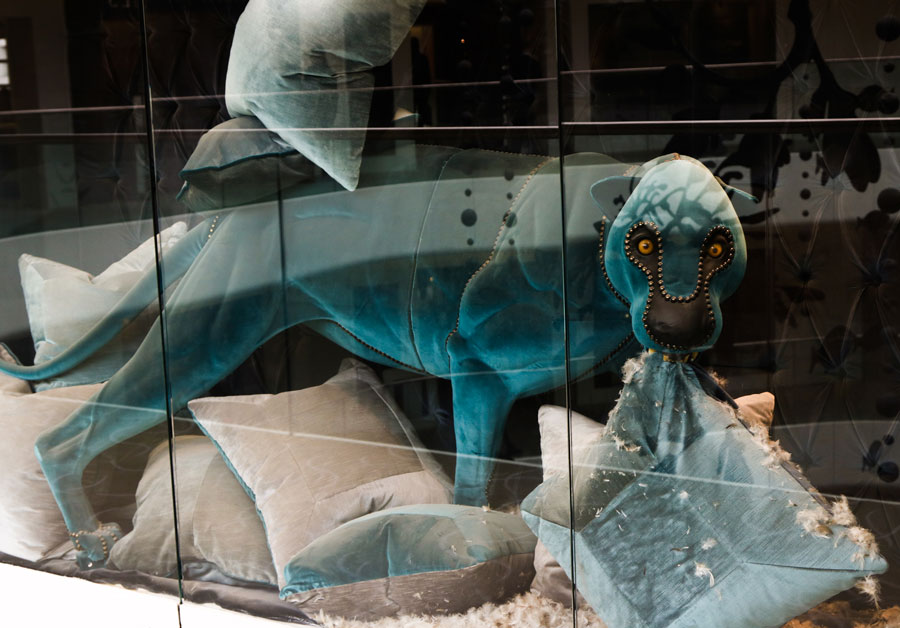
And finally spotted this beautiful velveted upholstered beast strolling the centre showcases – with fabrics by Jim Thompson.
I hope you have enjoyed our brief visual tour of London Design Week at Chelsea Harbour. If you did get to attend – please let me know what I missed !
Events at the Centre are always a great time to visit. The next occasion will be – Focus/19 on 15 – 20 September. Visit the Design Centre website for more details.





Sadly I didn’t make it this year so thrilled that you have captured so much inspiration from this years. Great to see Timorous Beasties there and shame their stay is only a temporary one! Thanks for sharing x
That’s a shame you didn’t make it Maria. Thank you for your comments – I am glad you enjoyed the post.
It was a feast for the eyes, wasn’t it! Wish I knew you were going, could have met up. I loved the cole&son showroom but had the most fun at The Style Library!
I am not ecstatic about DCCH to be honest, most showrooms seem to be going on about their busy BAU (like, 0 interaction from the staff at the V&A showroom, I am not sure they even lifted their eyes to acknowledge someone was roaming around haha). I much prefer other shows but like the space as it is filled with natural light from the domes!
Great write up! keep it coming!
I think you got there before me Jenny. I couldn’t get there until later in the week and it was so busy – there was a brilliant atmosphere. I had a great time and agree the centre is beautiful and a lovely place to visit. I talked to people in most of the showrooms, as I had to ask permission to take photos- so they had to talk to me ?!
Can I share an uncomfortable pov? I was really saddened by the Victoria and Albert colourful abstract art piece. Seems ludicrous I know, but I just didn’t think it was in keeping with the brand. I do like a mooch around DCCH
Hi Mary – don’t be sad – they were trying to be creative with the brand. I asked if it was part of the standard range – but it was just a show-piece for display. As a stylist, I appreciated the way they had linked the theme around the showroom to highlight the fact that their baths were colourful- using artist easels and paint pots.
I also went to DCCH for London Design Week and loved so many of the very same things that you’ve picked out! I thought there were so many wonderful and exciting things to look at – was very impressed and you’ve definitely covered some of my firm favourites!
That’s great to hear Catherine. There was just so much to see – I have only been able to cover a select few.
Goodness, where to start with all these amazing designers? Looking at the images I especially like Christopher Peacock and Style Libray. Sounds amazing x
Yes it’s definitely worth a visit Lucy – such beautifully presented showrooms.