THE ULTIMATE STYLE GUIDE

With so many choices and so many do’s and don’ts, it can be confusing to find a Style that’s right for your home. So to give you a helping hand we have put together our very own Style&Co ‘Ultimate Style Guide’. For further details of stockists please click on the individual boards to see more information.
The Truth About Trends
Should you listen to advice from interior experts – ‘be bold with colour, beige is boring’. Do you gaze in awe at dramatic, dark interiors on instagram? Should you just go along with the many choices of grey? Or have you heard ‘that’s just so over’ and blush pink or warm beige is the new neutral. So are we right to influenced by Interior Gurus or be led by trends?
The truth is that to benefit the economy, retailers and designers need trends. They create a desire in us to want and to buy new things. You see it primarily in the fashion world. People buy new clothes, not because the old clothes have worn out – but they want to be seen in the latest fashion.
Luckily with Interiors things move at a slower pace. Some of the main trends such as colours and materials can take a while to reach the mainstream market. But, you will find, that by the time you have decided to paint your home in the latest shade of grey, the Interior world has moved onto creating the next trend.
Ok, I must admit that after saying that, I do enjoy seeing new trends and fresh creative ideas. If the interior world never moved on we could all still be painting our walls magnolia and stuck in a style-warp of some bygone era.
The Fun Trends!

Monkey light from Graham & Green | Mouse lamp, Flamingo lamp, Flamingo statue and Rhino wall head from Hurn and Hurn | Pineapple cocktail glass from Oliver Bonas |Cactus glass from notonthehighstreet.com
To me it’s fun to see what they will come up with next, especially with home accessories. Didn’t we all just love the Cactus, until the Pineapple came along? And then the Pineapple was outed by the Flamingo and so on and so on. I don’t know about you but I don’t think I can keep up with it all. My advice would be to use trends reservedly. Use them for inspiration – but try not to let them dictate what you should have in your home. If you want to really want to be on trend, think of buying fun in-expensive accessories and leave the big purchases to items that will not date as quickly.
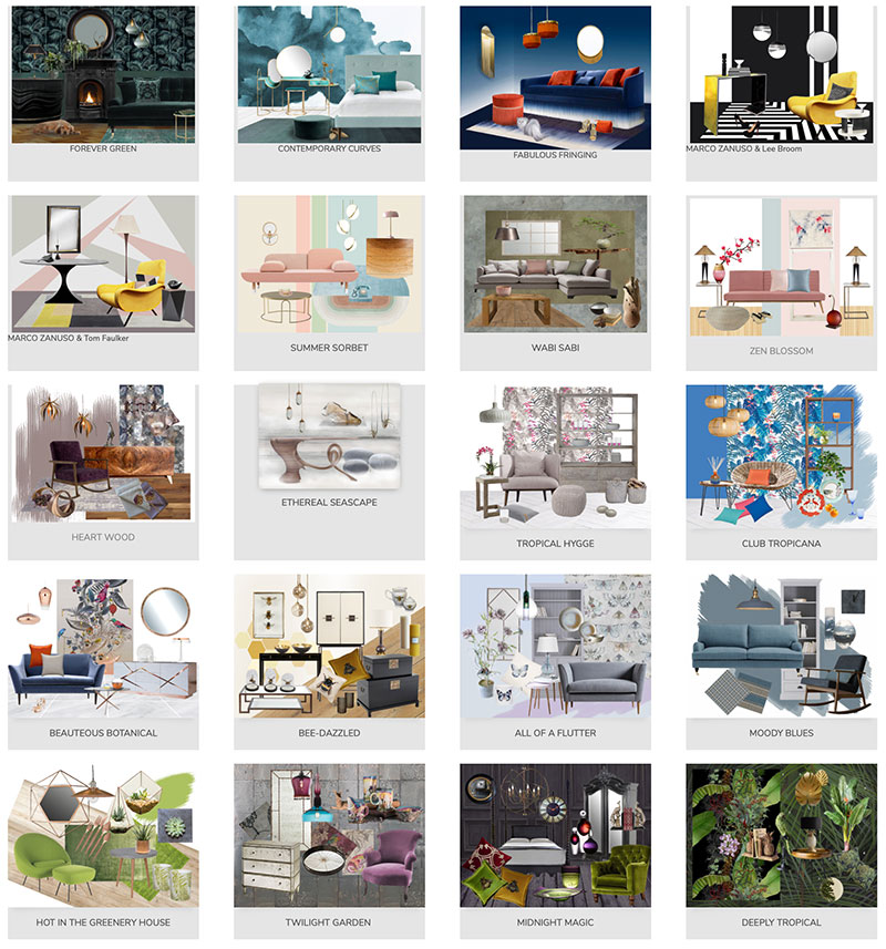
In this guide I have used some of the mood boards that we have created to help you decide just what Style is right for you. So take a look at our selection below and see what appeals to your own sense of style.
Style it with Colour
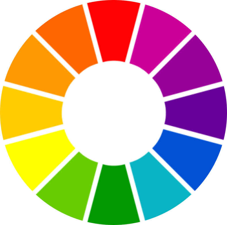
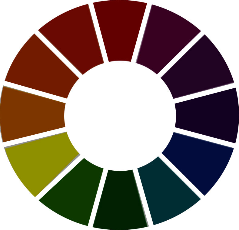
Colour is a key decision when decorating your home. There is much research into the psychology of colour and the atmosphere it can create within a home. The choice is in how you would like your home to feel when you step in the door. A simple way to choose a colour scheme is to find a print that you like and pull out the colours from there. A favourite painting or wall art can also be a great starting point. Another way is choosing a main colour that you like, which could be based on upholstery fabric or paint and use a colour wheel. Colour wheels can be found and printed off on line. To create a stimulating, complimentary colour scheme you can choose opposite colours on the colour wheel. However, to create a more relaxed home, find your chosen colour on the wheel and use colours adjacent to create a harmonious scheme.
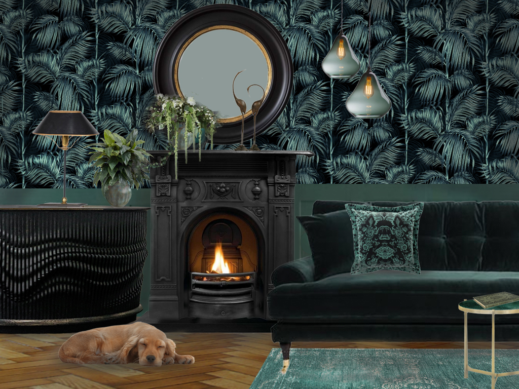
IN THE DARK
Moody, dark interiors are a look that is so popular on Pinterest and Instagram at the moment. I am not surprised, as it can look fabulously dramatic. This can look stunning in period properties with high ceilings and great architectural details.
As a general rule dark colours will draw the walls in. This look may suit you if you feel you want to create a cosy room. However, when rooms are dark lighting you need to pay extra attention to lighting. Use lots of lamps to create pools of light in areas that you need it.
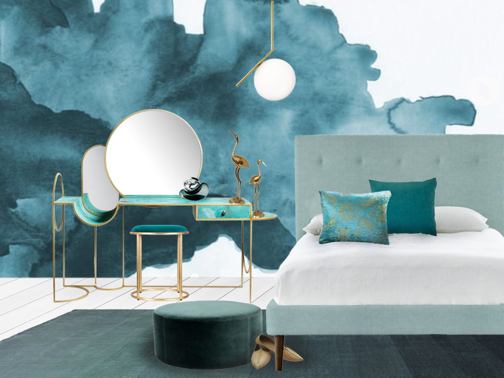
Forest Greens, Inky Blues and Teal are a popular choice at the moment.
Inspiration for this mood board was this Balearic Palm wallpaper from Charlotte Jade. Using the Teals and Inky Blues of the wallpaper design to create our pallet. We wanted to mix period and contemporary styling in this mood board, so have added a contemporary Ebonised Oak Cabinet by Jan Waterston. Dark velvet upholstery also adds a feeling of luxury to the design. If you prefer a totally period feel you can go for antique or up-cycled pieces.
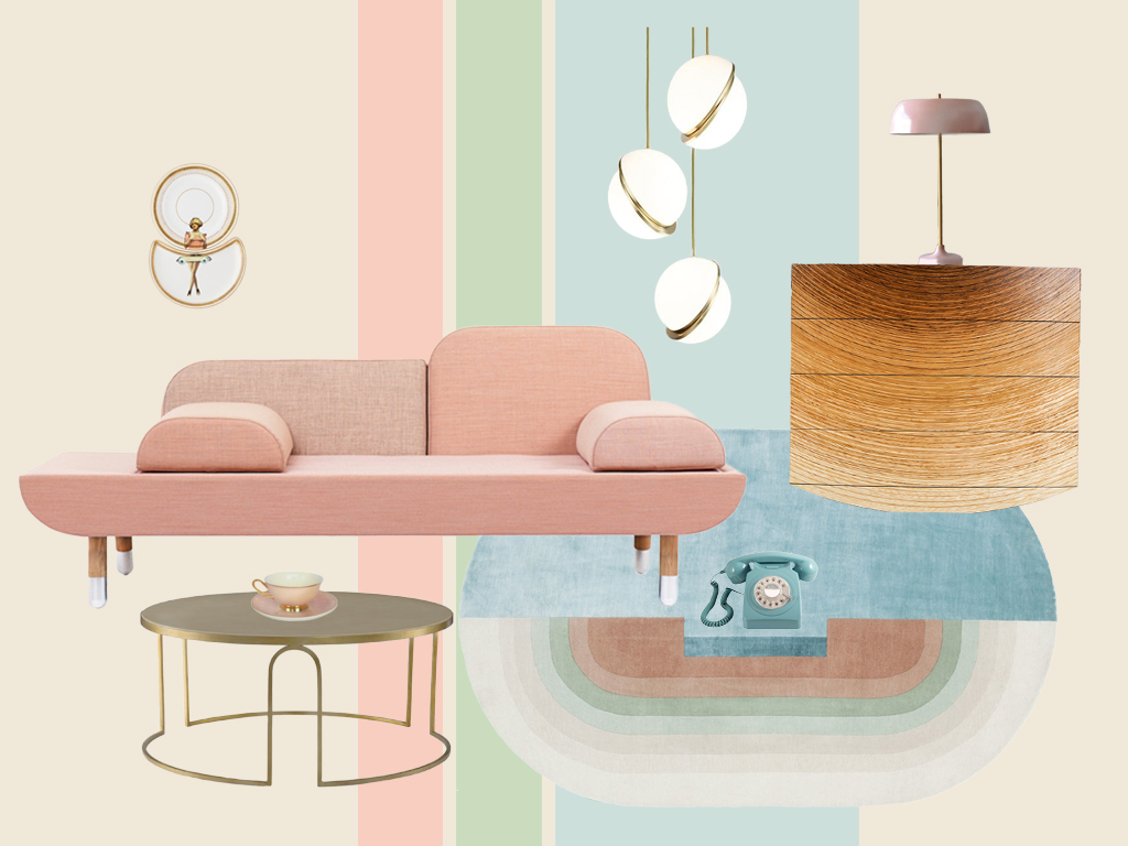
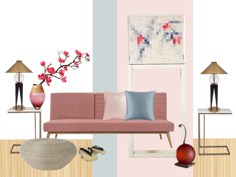
PASTEL PERFECTION
If you prefer it light and pretty our Summer Sorbet mood board may appeal. Inspired by the combination of colours in this beautiful rug by Designers Zanellato/Bortollo. A great staring point to give you a complete colour pallet for the room. These colours immediately suggested retro styling and inspired some creative styling.
The rug also had a geometric design which we echoed in mid-century accessories and contemporary furniture. Mixing old with new to give a contemporary feel. This unique cabinet by furniture maker, Edward Johnson, fitted the style perfectly.
If pastel colours are not for you. You could take inspiration from this – by using geometric retro shapes. Or just adding some mid-century style accessories to create a unique style.
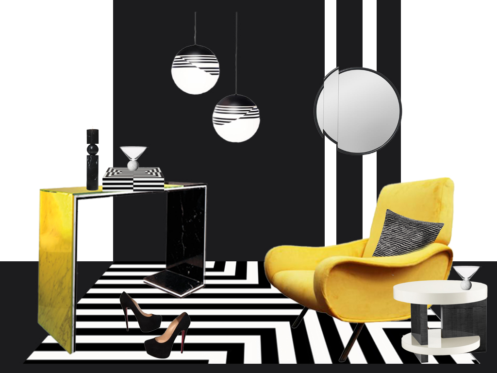
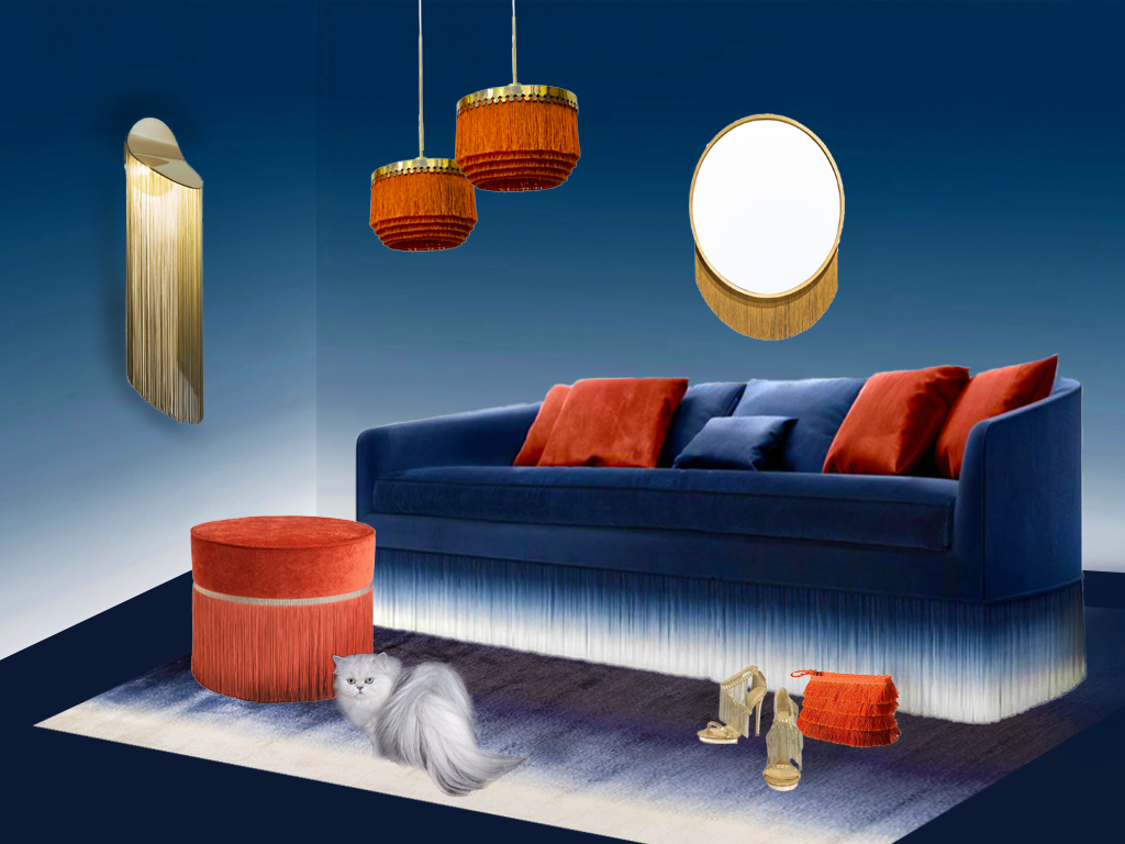
BOLD & BRIGHT
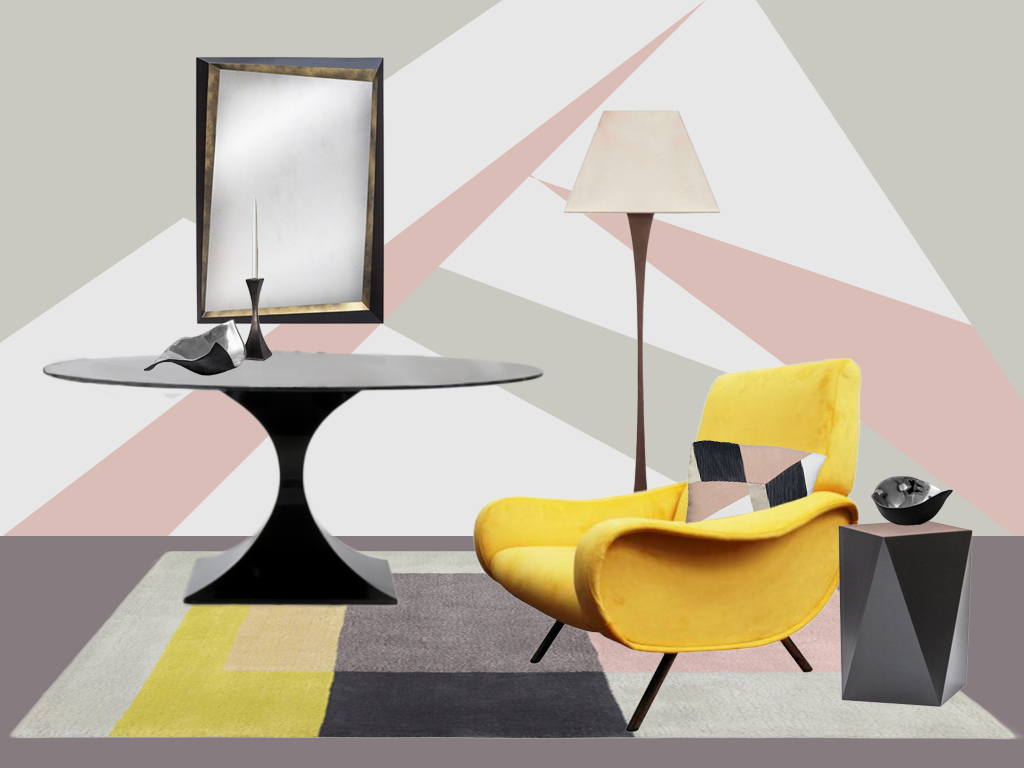
The use of colour can create quite a unique statement for a home. In the first of our mood boards to demonstrate this we have used a Monotone Black and White background. The fabulous retro Mario Zanuso chair not only makes a design statement – but adds a burst of colour to the room. The same Mustard yellow tones are added in the choice of furniture.
The second of our colourful mood boards uses two bold and complimentary colours. The use of complimentary colours works well both for bright colour schemes and softer muted tones. To find complimentary colours – just find your main colour and go directly opposite on the colour wheel to find it’s compliment. Here the main colour was inspired by this beautiful blue fringed sofa. To make a colourful rather than dark colour pallet we added burnt orange.
NEUTRAL HARMONY
A harmonious colour scheme is often a popular choice. With these two mood boards being the most popular pins on Pinterest.
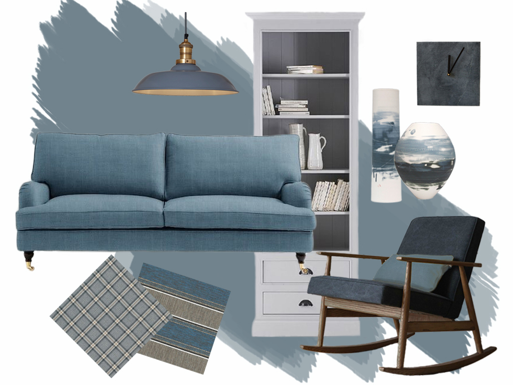
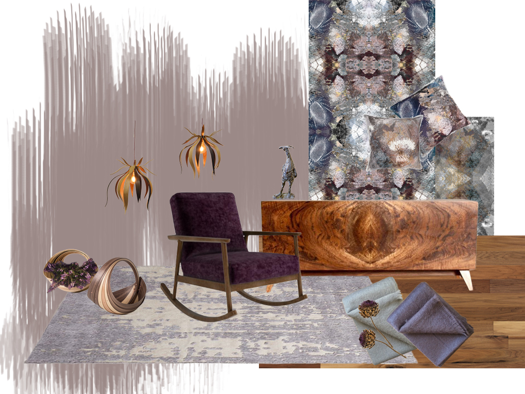
A harmonious pallet is created from colours that are situated next to each other on the colour wheel. As the name suggests, they work in harmony and sit well with each other. This creates a relaxed and subtle colour scheme. Dulux usually chooses muted mid-tones for their paint colours of the year. The following two boards were inspired two of their choices Denim Drift and Heartwood.
Denim Drift
The style for this board was slightly classic, with a mix of modern trends. A classic book case in a contemporary shade of grey. Urban style lighting, a contemporary slate clock and handmade ceramics by Ali Tomlin. With a statement mid-century style rocking chair, adding further interest.
Heartwood
This colour I would describe as a warm, muted, grungy heather, a surprisingly versatile neutral. Here we have picked out the warm tones in the choice of wood, with this lovely Burr Walnut Cabinet by Kevin Stamper. The tones of the fabrics and wallpaper by Mairi Helena harmonised so perfectly that they were used to set the style for the mood board. This mood board board has a quaint, contemporary, country feel. We added handcrafted Teasel lamps by Alice Blogg and Trugs by Jane Crisp. The rocking chair adds a touch of informality to contrast with the beautiful classic cabinet.
Style it with Theming
SCANDI
Scandinavian Styling has been very popular. This could work for you if you like a calm, relaxed, contemporary style.
In contrast to moody dark interiors its use of white and other light neutrals creates a feeling of light and space. The Buzz word is ‘Hygge’. Although I can’t tell you how to pronounce this – I have found out that it means ‘a feeling of cosiness, comfort, wellbeing and contentment’.
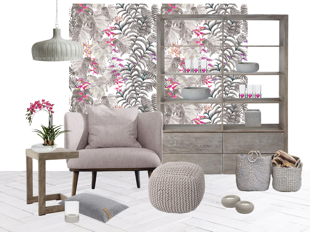
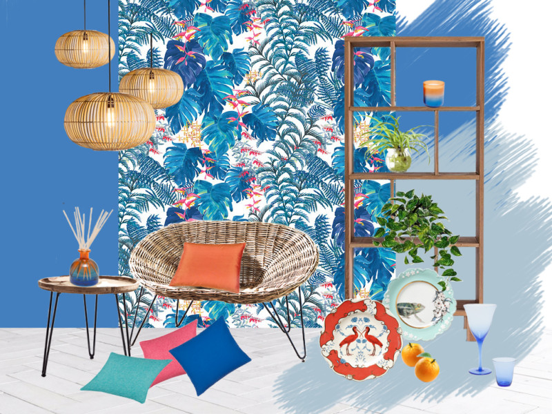
In this mood board we have used the most popular neutral of the moment grey and shown you how a splash of bright colour can give it style. We are showing you how to play with the trends on this mood board. Making a mash-up of Hygge and Tropical.
This mood board was initially inspired by the Tropical grey wallpaper by Petronella Hall. We then chose to give it a Hygge feel by adding simple lines in furniture, upholstery. Also using soft greys and natural materials but adding splashes of fushia in the accessories.
EASTERN
For this look I have chosen two mood boards. The first is called Zen Blossom. This Japanese Styling was inspired by two designer that I admire. The first being Kevin Stamper and his beautiful pixilated, veneered, Blossom Cabinet. The second is Louis Jobst, who creates these elegant handcrafted lights. Simple lines and styling were used for the sofa and tables, with colour inspiration taken from the cabinet designs.
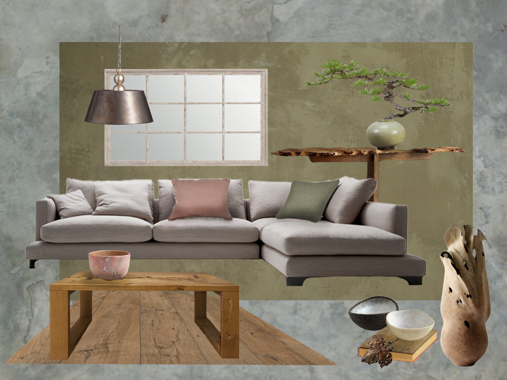
The second board is based on the trend for Wabi-Sabi. Based on Eastern philosophy, it honours the passing of time and the resulting patina of age and time-worn furnishings. It’s a look of natural materials and relaxed and informal interiors. This is rebelling against the throw-away society, where it’s out with the old and in with the new. To compliment this design philosophy here we have used soft earthy colours and live edge hand crafted furniture and sculptures.
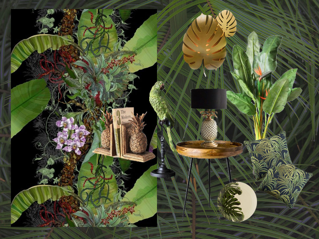
TROPICAL
Our Deeply Tropical mood board is inspired by this fabulous Topical Tropical wallpaper by Timorous Beasties. With botanical foliage wonderfully illustrated like a Dutch Still life painting. The dark colours give a feel of being deep in the Jungle. We have themed this with black and gold. The gold accessories adding a touch of glamour.
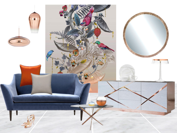
BOTANICAL
Kit Miles is a designer that produces some beautiful, botanical, wallpaper. He creates his designs with a Baroque styling, inspiring this elegant mood board. I wanted to create contrast to this decorative design with simple, contemporary styling for the furniture and accessories. Taking colours from the wallpaper for the furnishing and adding metallic copper accents. The further addition of marble flooring adds a contemporary, luxury feel to the room.
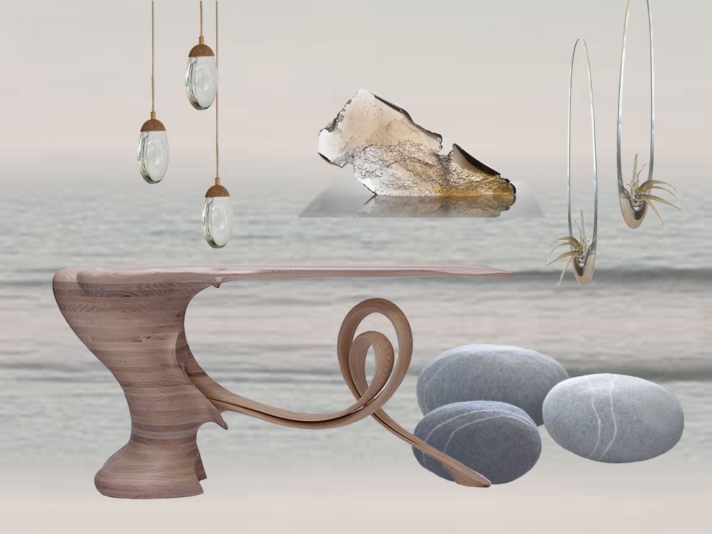
COASTAL
Think watery blues and aqua mixed with sand blasted glass and pebbles. Here we are showing our Ethereal Seascape board. Giving more of a designer look than the rustic limed, or white painted furniture, that you would normally associate with this style. Our inspiration was the Waiho console table by Robert Scott. His amazing designs are inspired by the erosion of wind and water on rocks and are just beautiful sculptures. The pebble lights from Ochre are a perfect compliment to the elegant design.
CURVES & LINES
Styling with geometric shapes has become a strong interior statement. The Linear look is being featured strongly in Bathroom design. With black being the prime choice. In the living room, curves are becoming popular for sofas and the Linea look for tables. I loved this striking Celeste Console by Lara Bohinc, which inspired my Contemporary Curves Mood board. Also featuring Mural wallpaper in this beautiful water colour, teal print. A great way to add drama and unique style to a room. With curves, you will be seeing the elongated Lozenge shape appearing as a new style trend, as that is now becoming featured in a lot of new designs.
Choosing your Style
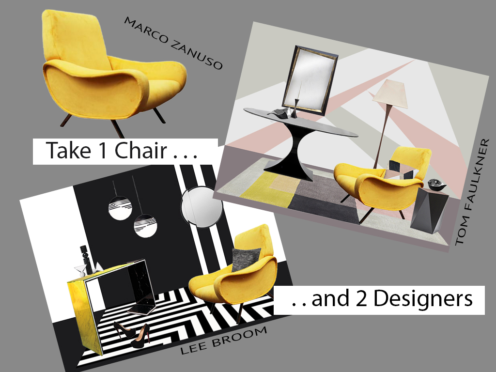
Styling the Marco Zanuso Chair
To compare styles, here we have two mood boards, created to show different ways to style the same chair. I just loved this mid-century Marco Zanuso chair, re-upholstered in mustard velvet. In our post Marco Zanuso we show you how to mix it with two different designers to create two very different Styles. In the first we chose Lee Broom with his striking Black and White geometric designs. This creates a real contemporary statement – so great for creating a dramatic showpiece interior.
The second designer I chose was the stylish Tom Faulkner. Tom produces contemporary furniture with a wonderful style of understated luxury. With this mood board I have still kept with the geometric theme, but found the colour inspiration from this rug from Nest. Accessories are often a great way to find a colour scheme for a room. It may be a rug, cushion, or print that you are drawn to, that can provide you with a ready-made colour pallet.
Styling the Petronella Hall Tropical wallpaper
For this comparison we have created two different mood boards with one wallpaper design. The difference in colours inspired us to create a different feel for each design.
We have Tropical Hygge and Club Tropicana. With the grey based design we have given it a contemporary Nordic room-set. Where-as the blue based print inspired us to create a bright informal beach bar feel. Whilst the print style stays the same the styling is all in colour and the choice of furnishings and accessories.
and finally ….
If you have been struggling to find a style that works for you – I hope this has given you a few ideas to work with. Often people will worry that they don’t know what they like. But if turn that around the other way – most people do know what they don’t like. So take a look at mood board page and cross off some definite no’s, consider the may-be’s and focus in on anything that you love and could work for your home.
It only leaves me to wish you the best of luck. Your home can be your sanctuary, your castle, your crash pad or somewhere that you can express your creativity I hope this has gone a little way to helping you create a home that you love.
Lin, you’ve really excelled yourself with this post. The mood boards are amazing and so considered. This really is a great post and I agree with everything you have said with regards to trends. I adore seeing new trends and how they filter through but I very rarely adopt them myself. For my own home, I need less transience and more longevity.
Hi Stacey – lovely to get your comments – that’s really kind of you. Good to hear your views on trends – they are always fun to see and breath a bit of new life into the interior world. However, they should never dictate what you choose for your own home.
I love love love this post Lin! You’ve put a lot of time and effort into this post and it really makes you think. My favourite board is In the Dark. I do think it’s hard to not incorporate elements of current trends into a design even if you’re not a follower of them.
Thank you Maria – it’s great to hear when a post is appreciated. Good to hear your preferences. Yes, I must admit that I don’t have a set style – I am not swayed by gimmicky accessories, but I am constantly excited by new ideas.
What a fabulous blog post! So much detail and information. I must say I’m partucularly taken with the mural you’ve shown with the Lara Bohnic Console. My thoughts on trends are that have always existed and instead of being driven by high society and “court” they are, on the whole, more democratic. BUT there is no need to change up your decor every year so that you can be “in vogue”.
Thank you Mary! There will always be trends and we will always be influenced by them. Mainly as the stores will be constantly stocking new designs and it’s always exciting to see something different. I think it’s great to see new ideas and find it so inspiring to play with beautiful colour pallets and add unique designer pieces.
Love this! Love the pastels mood board! So many to choose from that is so great to find something just right for you. So true what you say about trends. I really hope fast fashion business model doesn’t become a prefered business model of furniture companies… for obvious environmental reasons.
Thank you Marlene – it’s really interesting to hear which mood boards people prefer. No I don’t think it will ever get as fast paced as the fashion world. I think homes are more of an investment – so you are more inclined to think about the long term value of any purchases.
I love this post. A great insight into how to actually make trends work for your style and so many inspirational mood boards to help create a perfectly styled room. Great post Thank you.
Thank you Fiona x
I think trends are one of those things where people shouldn’t always feel they have to keep up with it. Find something you truly love and update and improve on it when you like. Personally, I love the Scandi mood board. Bright and simple, yet inviting and comfortable. What a great post 🙂
Thank you Ricky – it’s good to hear the style you like. I am hoping that people will pick out ideas from mood boards that they like and be able to create their own style.
Wow such a detailed post! My problem is I change my mind too often and always want to redecorate with every new trend!
I can understand that Sam – my taste is constantly changing. I tend to renovate and move on – so fortunately I get the chance to try out lots of ideas.
So many beautiful Styles here and I love how they are not “trends”, we can create styles ourselves with help from others, and in this case – you! I do love the Eastern palette, so soft yet quite Scandi and the colours help you really relax compared to some of the others. Thanks for sharing!
Thank you so much Paul – it’s great to hear your views. Everyone is unique with their home. While some want to feel relaxed, others will want to be stimulated and unleash their creativity on their home. I love being able to delve into all the styles and create mood boards that may inspire people to create their own style.
What a brilliant overview of so many fantastic looks. Really easy to understand, thank you! x
Thank you Becky – that’s lovely to hear.
Thank you so much for sharing this with us Lin! What a fantastic collection of styles and so interesting to see how they could be implemented in slightly different ways to suit your own style / personality. I definitely think design, style, and in particular trends, are down to individual taste and what YOU love, and no one else. I think people are almost a little scared of sticking to what they love instead of following all the other trends … (perhaps because it’s “tried and tested”?)
Sorry for rambling on there! But thank you for sharing such an insightful and comprehensive post !
Thank you so much for your comments Jess – it’s so good to know other people’s opinions about Interior Design. I like to get rid of all pretentiousness about what you should and shouldn’t do. People’s homes are so individual – it’s great to follow a trend if it’s one that you love. But, your home should make you feel happy – so I say just go for a style that you love, or just make up your own!