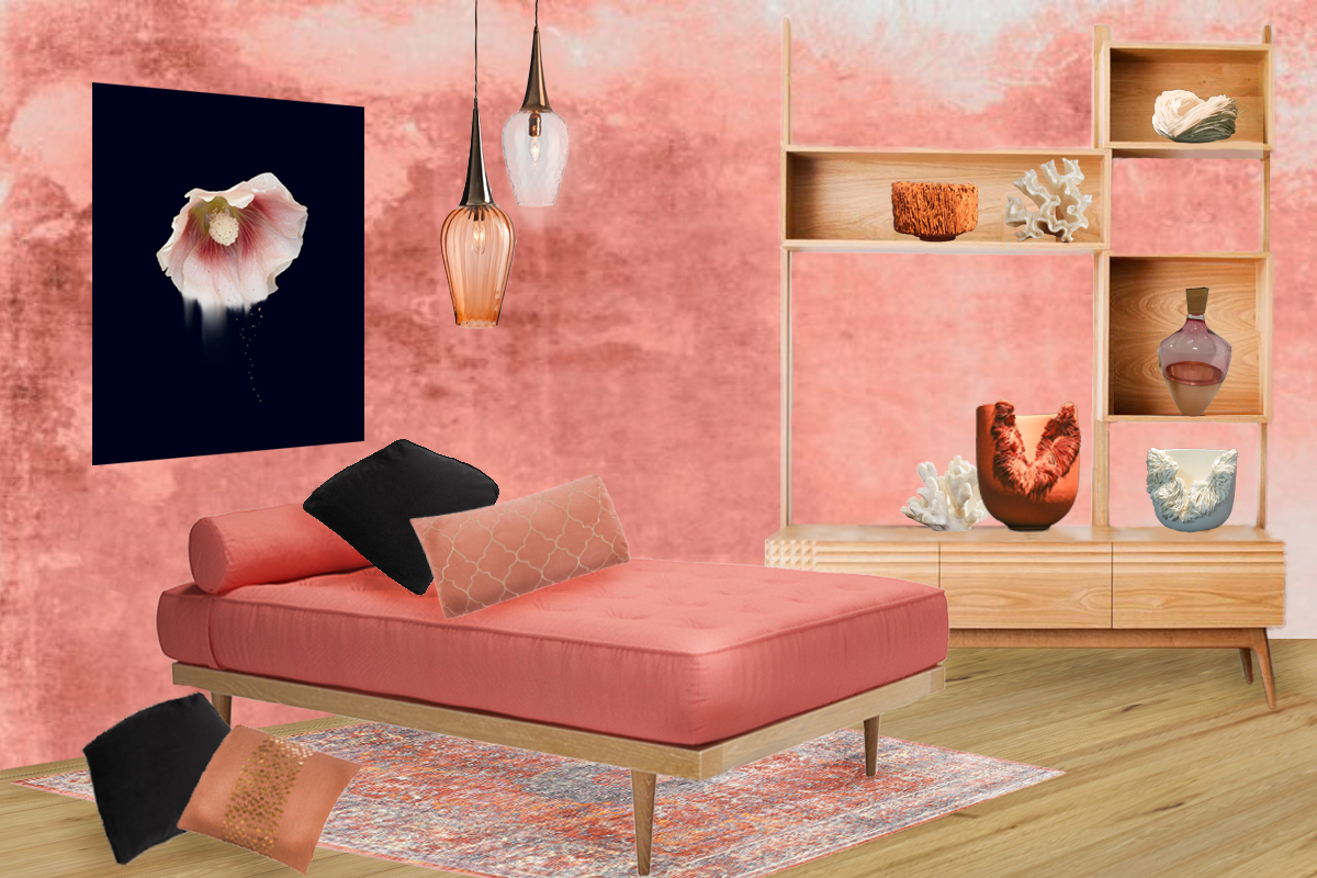
Pantone’s Colour of the year 2019!
Pantone announcing Living Coral as it’s Colour of the year for 2019, raised a cheer amongst most of the Interior Design world. As usual, Pantone have chosen quite an Intense shade. But the difference, this year is that it’s a warm and pretty tone. It lends itself well to both fashion and interiors. I can imagine lots of pretty pastel bedroom appearing on instagram this year. You can soften Living Coral with white and it looks very pretty with pastel blues and minty greens.
For my Living Coral Inspired mood board I have looked at giving this an elegant, more grown up, appeal. By mixing this intense shade with navy or black – you can immediately give it an air of sophistication.
THE DESIGNERS
Simone Webb
To show you how to Style this colours I have chosen some of my favourite Designer/Makers that will create a unique design.
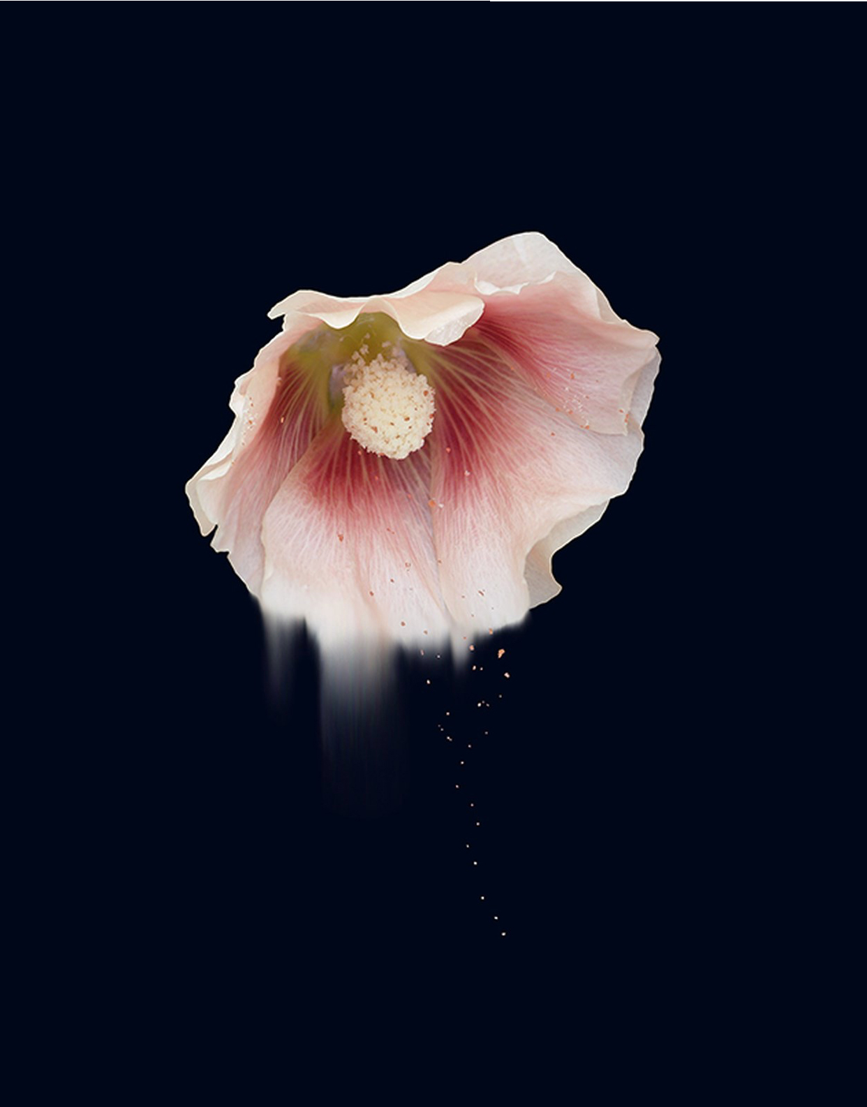
I have recently featured the beautiful Art Work of Simone Webb and her floral designs were a perfect match to feature on this board. The print shown is ‘Fecundity III’ on Aluminium with Copper leaf. Simone has a wide range of Floral images in Coral tones and for a more pastel scheme her Tellurian Riches would look great. You can see more of Simone’s work on her recent post.
Olivia Walker
Another great Designer/maker that fits with the Living Coral theme is Ceramic Artist, Olivia Walker. Olivia throws precise forms in Porcelain and then makes paper-thin additions to the form. Creating an organic sculpture that resembles coral or lichen growing from the vessel. She has previously featured on our highlights of The London Design Festival and it’s great to have the chance to showcase her work on this mood board.
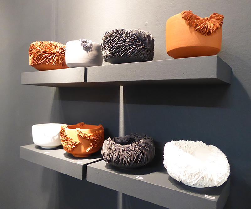
Olivia Walker
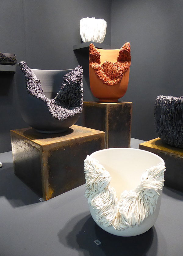
Pia Wustenberg
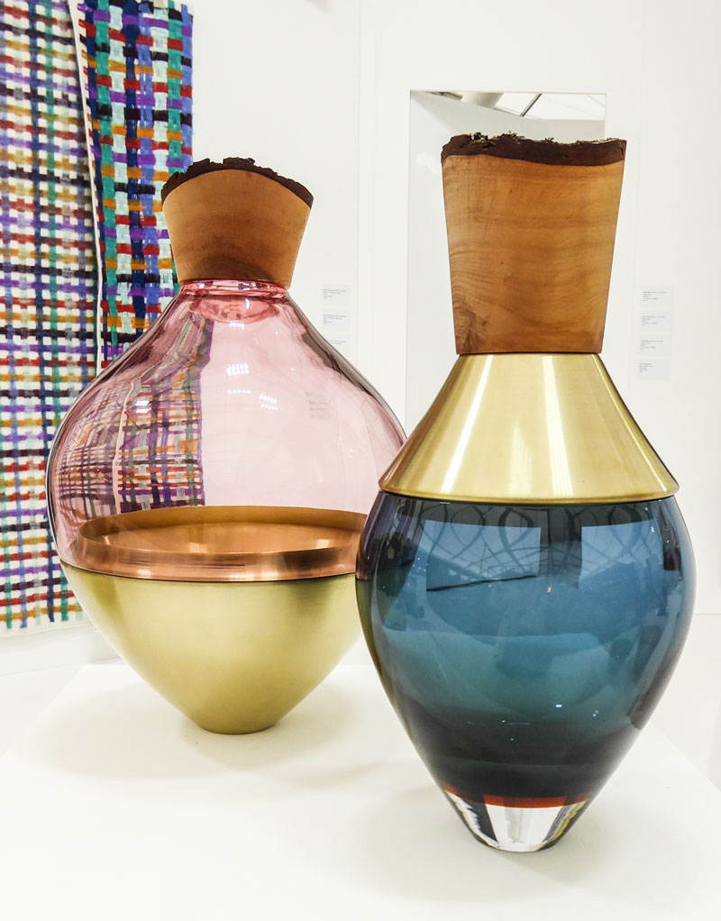
I have also selected Glass by Artist, Pia Wustenberg. I love the simple just under-stated rustic look of her stacking vessels. They just look as if they could have been washed up on the sea shore.
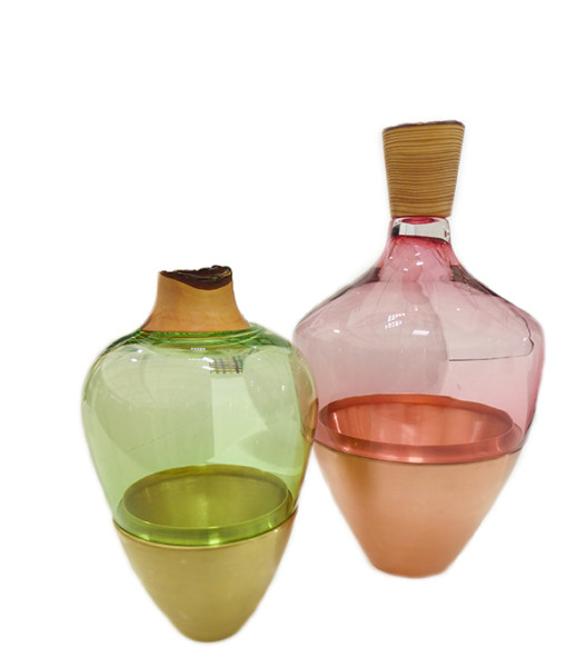
Pia Wursenberg
Nick James
Light wood tones of Oak work well with this contemporary mood board. I have chosen furniture designer Nick James. The Fluted Collection is made from European Oak. However, as all his pieces are made to order you can chose from a selection of different hardwoods to compliment your home.
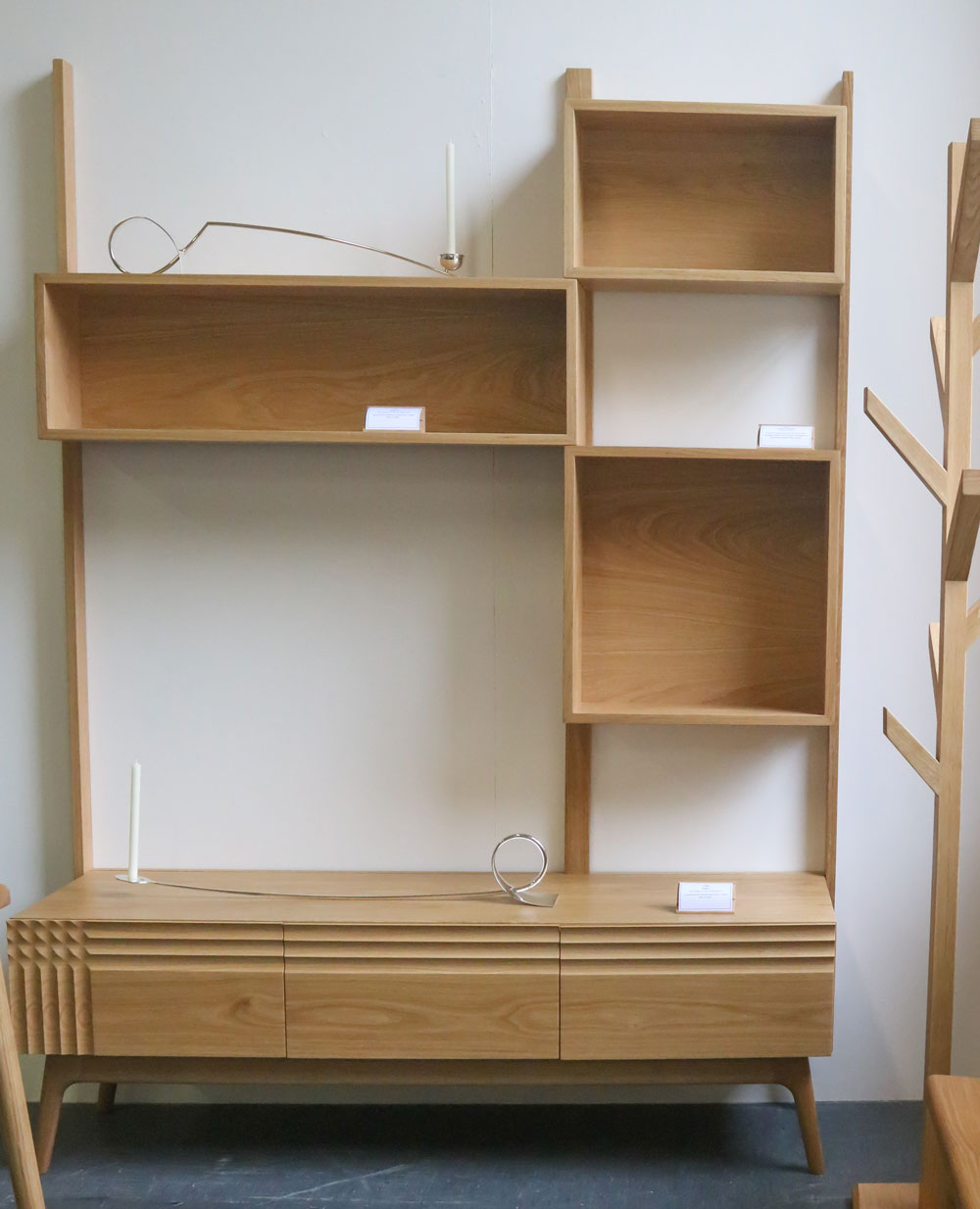
Nick James – Fluted Cabinet
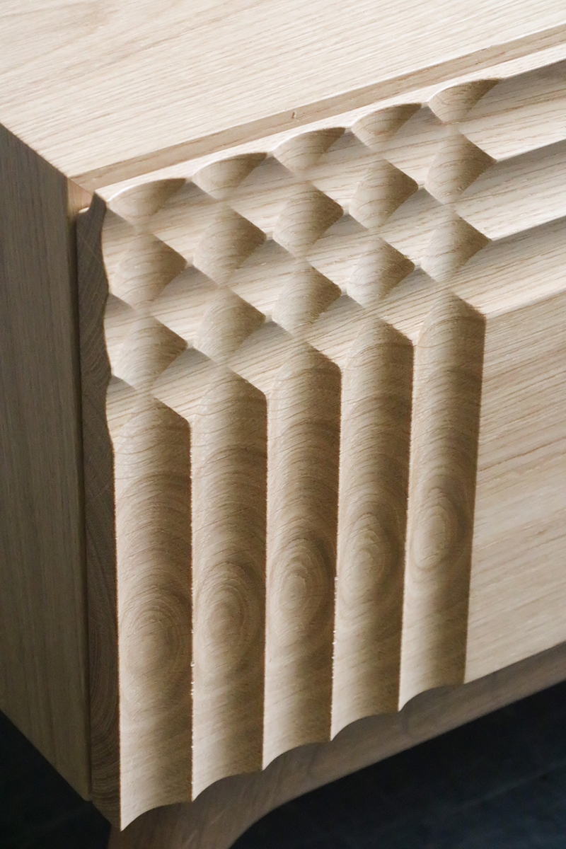
Fluted Cabinet detail
Wallpaper
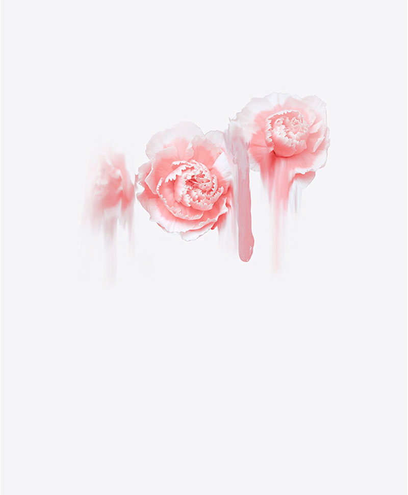
As a solid paint colour for walls Living Coral can be quite intense. So here I have used a wallpaper by Muralswallaper called Red Grunge. It’s watercolour effect creates the beautiful subtle tones and textures of Coral.
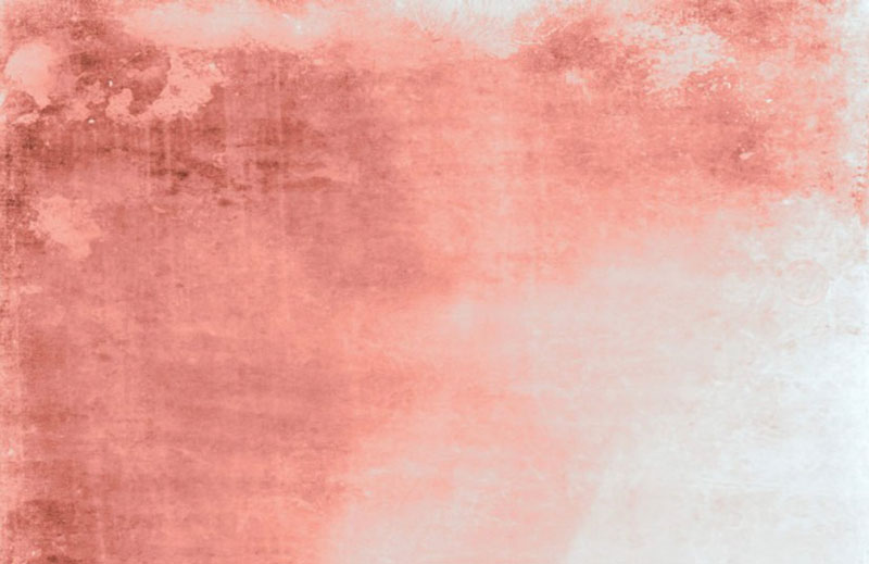
Murals Wallpaper – Red Grunge
Statement furniture and matching accessories
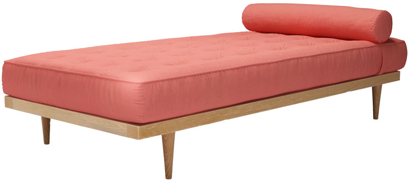
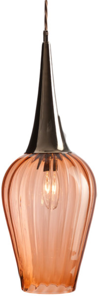
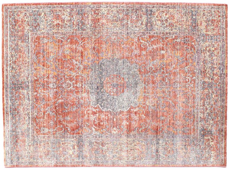
Coral is a great colour for Statement Furniture and I have chosen a contemporary design for the sofa. A daybed in this great colour by Sofa.com. The lighting is hand -blown retro style pendants by Rothschild & Bickers and the Bamboo silk rug is from Rugvista. There are a great selection of Coral cushions at Amara from which I selected black velvet and pretty decorative designs in coral to compliment the colour pallet.
If you are looking for more Style inspiration – why not take a look at our other unique Style&Co mood boards !


For the first time in years I actually don’t mind their colour choice. I think it will work best as an accent colour rather than the main colour choice in a room. But I’m excited to see what people do with it in their homes.
Definitely an accent colour for most Stacey. I haven’t seen many rooms appearing in Living Coral yet – butI agree it will be interesting to see them.
Such a lovely colour to introduce into the home and I do love your mood boards! So inspirational and love the key pieces you choose to create them. I’m still in love with Simone Webb’s artwork from a previous post you did, so beautiful! Fab post!
Thank you so much Maria – that’s very kind of you to say that. Yes I love Simone Webb’s artwork – she was perfect for this mood board.
That is an interesting colour and way better than last year purple in my opinion. Definitely easier to work with if you are a designer I imagine? I really like that day bed from sofa.com!
Isn’t it great Marlene – I love the simple slightly oriental style to it.
I love that wallpaper it’s totally gorgeous. I like the idea of living coral but I think it all depends on what it is paired with.
Yes I agree Mary – I don’t think you can go wrong with black or white.
I think it’s the type of colour that will grow on me once I see what people do with it, but I do love that wallpaper! How beautiful X
Thank Lins – I love the watercolour effect murals – just need to find the right room to decorate with it.
Coral with black sharp accents is my favourite. So sophisticated! And I agree with you, this year they have (finally) picked a pretty colour.
Yes Juan – I am sure this is going to be pretty popular too!
I’m a fan of this year’s colour of the year and I really love your choices. My favourite things are the glassware and lighting.
Thank you for your comment Fiona – that’s great to hear !
I actually think it’s a really lovely colour! I can’t see the masses slapping it over entire walls, but definitely a really palatable shade
I know what you mean Karen – I do feel it’s a bit intense for walls, but great for accessories and statement furniture.
Oh its a beautiful colour isn’t it! So bright and summery! I can imagine it would look great paired with black too as you’ve suggested.
Thank you Sam – yes I think it would be great choice for a Spring makeover!