How to use the new trend for Green
At the end of 2016 Pantone released their new featured colour of the year for 2017 – Greenery 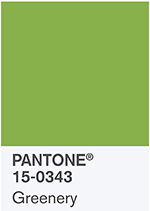 – a mid-tone saturated apple green that up until now would have only featured in my Tropical moodboard. But to see how this could work for those of you that really want to be inspired by this I have searched the high street and internet for some greenery inspiration.
To go for full-on Greenery for your walls – I found a great match from Designers Guild with their ‘Green apple’ which they refer to as a crisp, relaxing shade of apple and I was surprised to admit that when I saw their bathroom wall below on their website, I did agree with them.
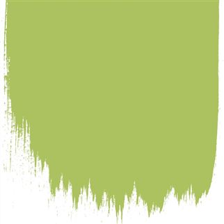
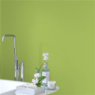
The Designers Guild website also shows this colour on other walls, to give you an idea of how the paint could look in various room in your home. They have several paint finishes: matt emulsion for walls, eggshell for woodwork and a tougher paint for floors.
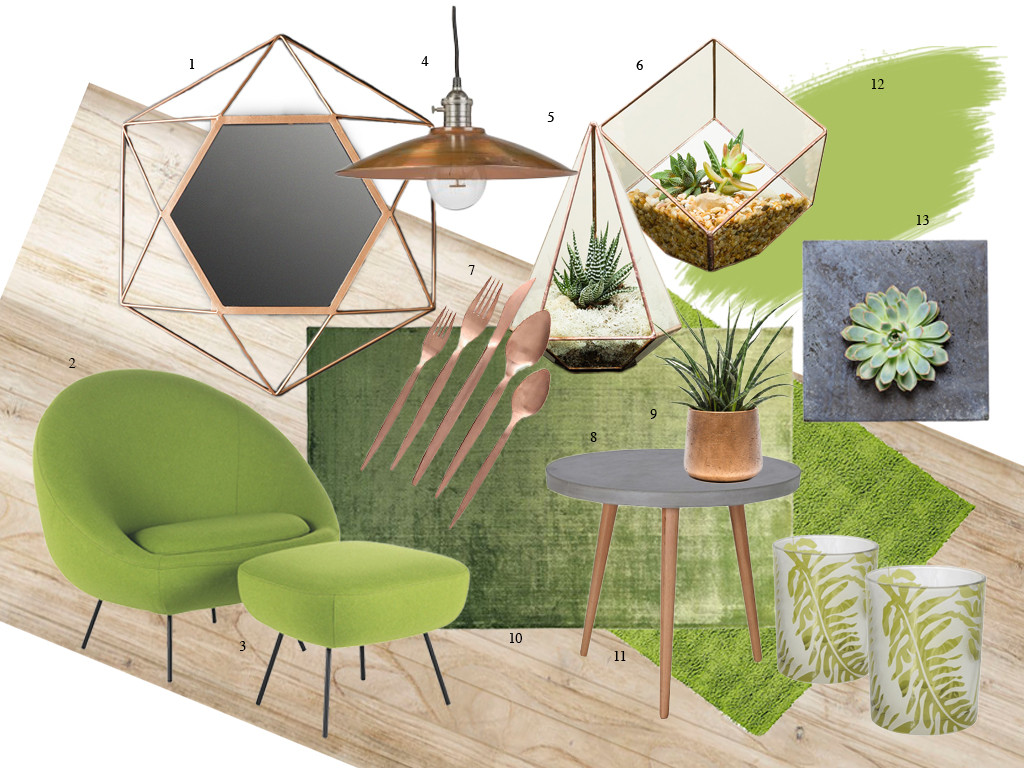
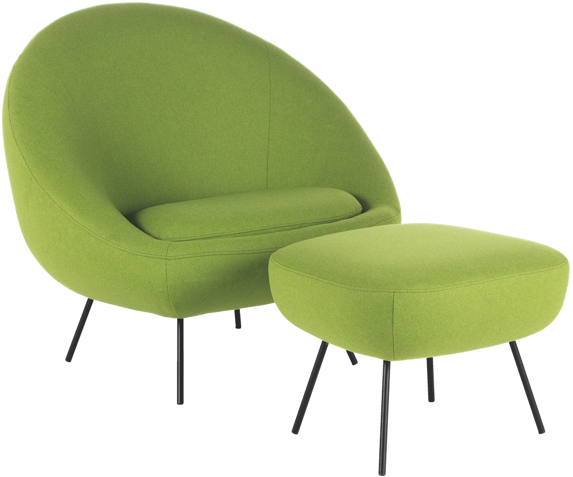
At Habitat I was thrilled to find greenery in abundance. My first discovery, this retro style armchair called Misty, is covered in a practical woollen mix fabric. It’s great to have some statement pieces of furniture and in this colour any design will certainly give the wow factor. My fabric swatch arrived in the post a couple of days later and being just a tad darker in tone matched perfectly on my mood board.
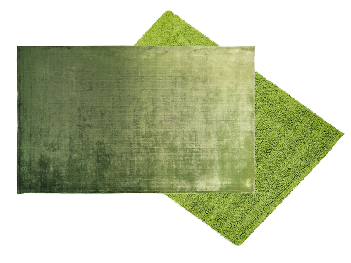
These rugs from Designers Guild were a great colour – the lustrous Emberson, that looks like shimmering grass would give a luxurious look to any room and the longhaired, fine felted Shoreditch Lime rug would add a fashionable textured look.
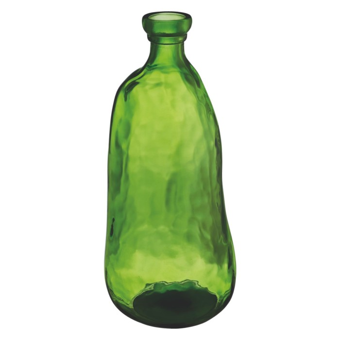
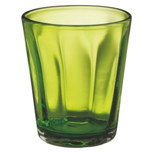
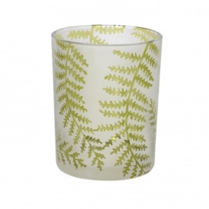
Other finds in Habitat included this green recycled glass vase and green glass tumblers and a great find from Sweet Pea and Willow were these pretty fern tealight holders.
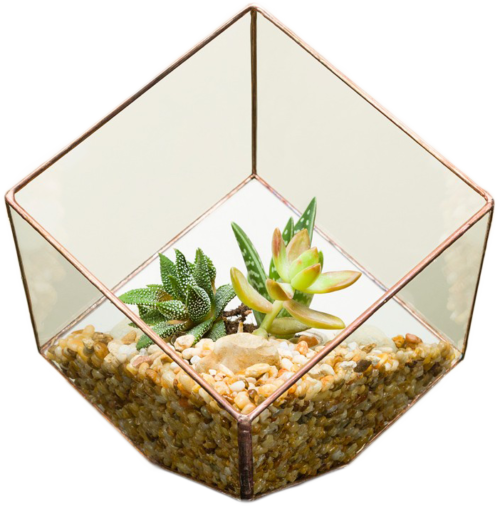
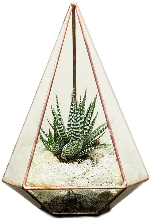
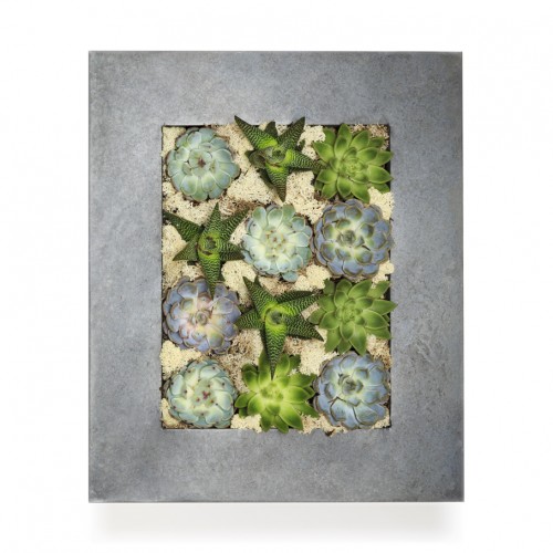
Finally, perfect for the greenery theme, the revival of house plants fits perfectly. If you have to go faux then that’s fine – but if you can master a watering, real plants can bring life into a room and are such an inexpensive way to style your home. Terrariums are back in fashion with some elegant geometric designs and a great way to bring the outside in. The styles below in copper I discovered on The Urban Botanist website, along with other great ideas such as creating living walls. I would love to have one of their zinc frame succulent wall panels, it would be perfect in my grey kitchen. They supply all planters either complete for display or empty for you to try out your own gardening skills.
After all this research I am feeling quite positive about the prospect of the Pantone’s Greenery influence on interiors. Although I would not usually chose a colour as strong as this – I would say if you go for a background of white walls and natural wood flooring, add some healthy house plants with green accent furniture and accessories this colour will look very fresh and up-lifting.

I’m filled with Green inspiration!
That’s great Angela – good luck with the decorating